


Choosing Your Wedding’s Color Scheme
Wedding planning is tough, and even harder without a palette to work from. That’s why I’m here to help you find the perfect color scheme for your dream wedding! Having colors locked down can help you work your way down the planning checklist efficiently, choosing complementary details that support your vision. Since you want everything to work together, I encourage you to pick your color scheme early! It really does put every other thing in perspective.
Armed with colors, you have help choosing your dress, decorating your venue, choosing stationery, and creating a cohesive theme. Colors can set the mood and the tone for the day, so you want to get it just right. So where do you start? Right here! Read on for my “how to” guide, created just for you…
What’s the most popular color scheme?
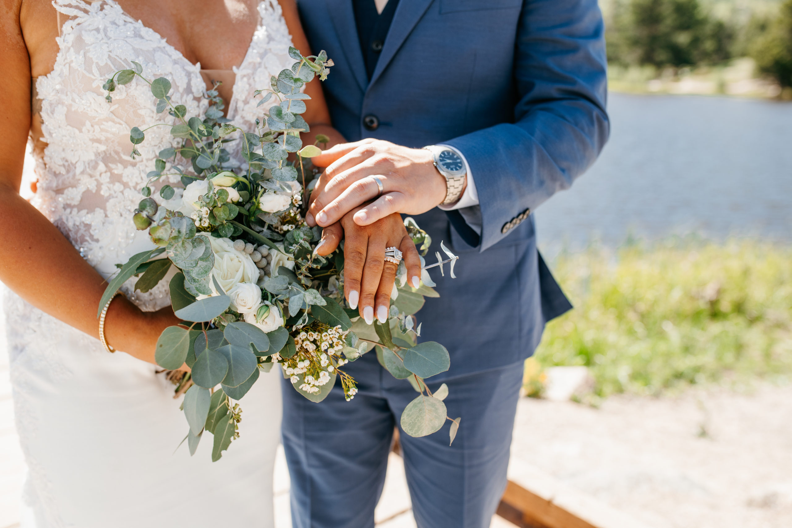
I’ve shot a lot of weddings, and believe me, the most popular color in a wedding palette is the white, champagne, and ivory combo. Almost every wedding has a touch of these colors, either as a base, supporting color or accent. And why not? They are classic neutrals, and pair perfectly with every theme, style, and venue. They also represent peace, life, and class. I suggest starting here and choosing your neutral color first, then building from there. (And definitely tie up your palette with a metallic color as an accent!)
What is the most popular wedding color combination?
Trending wedding color combinations lean toward these five variables: Nature, season, personality, theme, and significance. With these things in mind, I’ve seen the following combinations rise in popularity:
- Industrial-chic weddings: Beige/champagne
- Romantic settings: Shades of cinnamon and dusty rose to dominate
- Bohemian brides: Terracotta and greenery
- Vintage vibes: Pantone brown and rose gold combo
- Rustic weddings: Various shades of gray
- Nautical/beach themes: Lighter blue/dusty blue and burgundy combo
How many colors should you choose?
In finding the perfect color scheme for your dream wedding, the standard rule is to choose a maximum of three colors (unless you’re going for an ombre or neutral look). If you bring more than three different colors together, your wedding might lose focus and direction.
In addition to the five factors listed above, there are a few other things to consider when choosing a color palette…
#1: Think about the season
You don’t have to follow a trend if you don’t feel like it, but some colors are natural enhancers for each season.
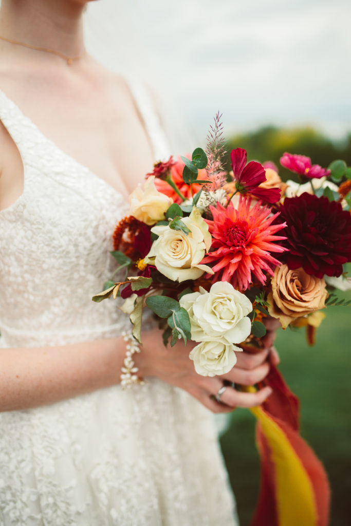
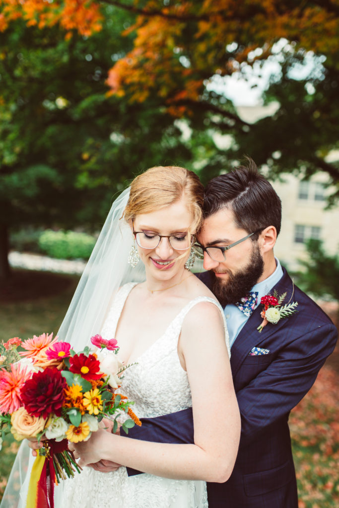
Fall is arguably the most beautiful season of the year. In choosing colors, get inspired by the red, orange, and then yellow colorful leaves. Look at the warm and vibrant color of the environment. Think about the rich jewel tones of the landscape. Ripe, and tastier fruits, foods, and the lively countryside.
For Fall:
- Blush, frost, and boysenberry are calm, romantic, and have rich fall colors (and great for Bohemian weddings)
- Pineapple, charcoal grey, and Cardinal red is a bubbly but laid back combo (especially for industrial-chic weddings)
- Hunter green, orange, and brown are luxurious, lush, and energetic (best for a country-style wedding)
- Hot maroon, cameo pink, and Aegean blue are a perfect combo (and a tasteful nautical/beach palette)
- Silver, beige, and dove gray is a whimsical combo for the perfect fall wedding
Winter is cold yet stunning. Natural elements like a fluffy white blanket of snow can make a panoramic picturesque. The blazing orange, red, and blue cozy fires and colorful veggies with fruits keep you inspired. You can also draw inspiration from winter blooms like roses, orchids, French tulips, mini gerberas, gardenias, Casablanca lilies, and more. The winter season is a calm and cold one. But you can bring some fire with Marsala, Aubergine, and a bright red combo.
For Winter:
- Black, gold, and ivory is a perfect blend for a classic wedding
- Peach and forest green with a metallic accent will fit a rustic/chic theme
- Marigold, cream, and turquoise is a serene yet powerful palette fit for whimsical a wedding
- And for the boho or waterside wedding, white and dusty blue or indigo and orchid combos are perfect.
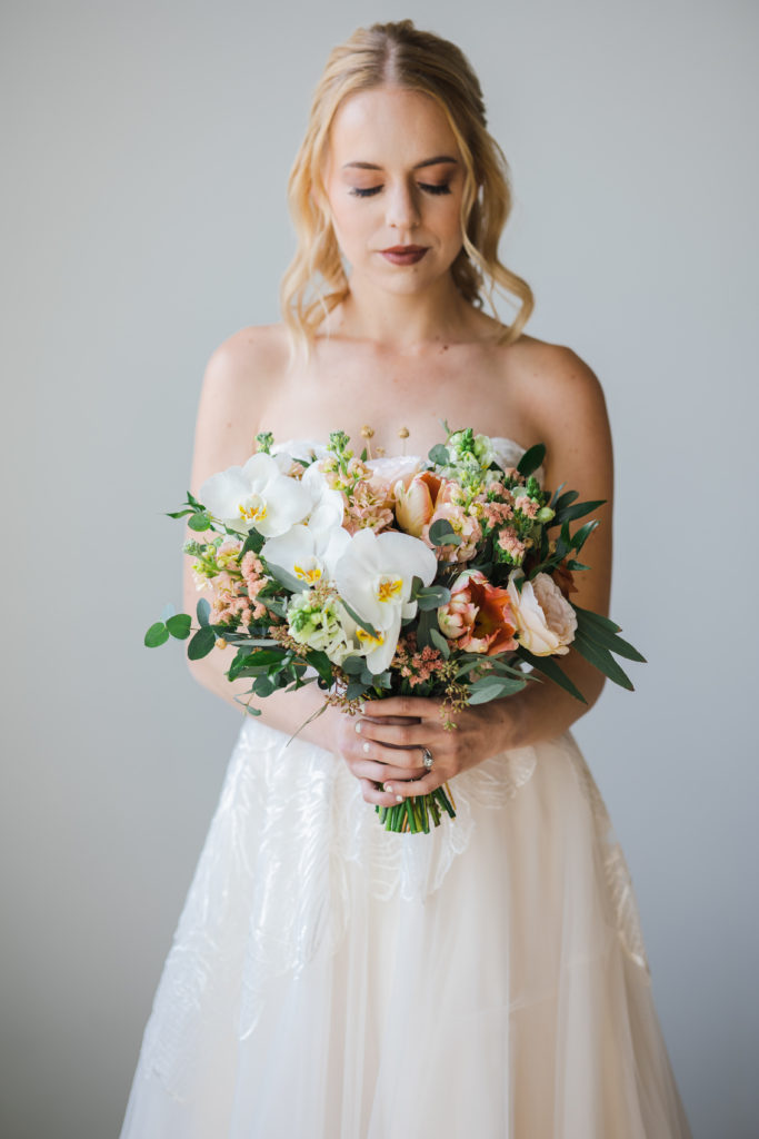
Spring is the best season for outdoor weddings. You can even be inspired by the clear blue skies! Think about the bright days, blooming bulbs, and budding trees. The earth gives off rich tones as it thrives, creating ethereal palettes.
For Spring:
- Work around a dusty blue and white color palette for a magical and elegant wedding with rustic quality
- A light pink, white, and ice blue combo is great for rustic, vintage, and modern elegant themes
- Green and coral is a refreshing and vibrant combo for country chic and outdoor weddings
- The delicate gold and mint combo is a classic and refined choice for the timeless couple
Summer features the fiery vibrant sunshine during the day and Tetrazzini sunset, which makes a glorious piece of color inspiration. The sun transfers energy to everything, bringing them to life. Also, look at calm water, budding flowers, and bleached leaves. There’s so much in summer nature to tickle your fancy!
For Summer:
- Sage and poppy is a warm yet serene combo that lends credence to tropical tones and leafy motifs
- Green, white, and gold is a summer color combination for the classy, neutral, or glam color palette
- Cream, classic blue, and grey is both a romantic and hypnotic combination
- Orange, pineapple, and pale pink is a vibrant sorbet-sweet combo for a more playful or bohemian theme
- Embrace a lilac and lavender combo for every kind of outdoor wedding
#2: Consider the venue
Most wedding venues try to create a neutral space for your ceremony and reception, but others have built-in colors you may need to work around… especially if they’re older, more classic event spaces. Request a walk-through, or take photos of your spaces while you’re there! If there’s greenery that can’t be moved, carpeting, or even existing flowers planted, those colors will be part of your palette whether you pick them or not!
#3: Don’t forget to do your research
Before you decide on a final color scheme, be sure to do some research. Some of your favorite hues may not be easily found depending on the date of your big day! Look at your choice of flowers to make sure that your ideal colors are in season and available. Be prepared to choose linen colors for curtains and tables by checking if your perfect colors look the same as textiles. Check for hues available in stationery card stock, decorative accents, and accessories. Check real weddings on Pinterest and look out for color combos that appeal to you. Judge them based on cohesion, photograph compatibility, accessibility, and personal style.
#4: Choose what you like, not what you think you should do
As you choose colors, remember that they should be expressions of your personalities. Choosing your colors can’t be about what other people think or have done before, but rather about what you love. What’s your signature color? Check your closet, makeup box, shoe collection, and even your kitchenware. Chances are, you buy colors that you love most. Incorporate them into your wedding because, like we always say, it’s all about you.
#5: Stay away from color scheme trends (especially ones you don’t like)
If you don’t care for trends, you’re in luck! The goal for the perfect color palette is to remain classic and timeless. Rather than working from in-style, gimmicks that will quickly look dated, go personal. What do you love doing? What’s your wedding destination? Who’s your dream designer? What are your favorite flowers and music selections? What time of the day do you want to get married? When you think through these details, your wedding is halfway planned.
- Shades of green like pistachio, avocado, and matcha are perfect traditional colors
- Light blue tones like cornflower, periwinkle, French blue, and powder blue are great additions to timeless modern and romantic themes
- Elegant pastels like mint green, lavender, lilac, and bubblegum pink are always whimsical
- I also love a throwback bright; like yellow, fuchsia, teal, cobalt, and bright red for a classic glam look
#6: What’s your style?
It’s not cast in stone that you need specific colors for a wedding style, but some wedding styles must have a touch of specific colors to pull them off through the seasons.
- Romantic: Shades of pink, blue, and ivory
- Vintage: Gold, turquoise, light blue, cantaloupe, apricot, moss, and honeydew
- Whimsical or Boho: Yellow, blush, white, salmon, daffodil, mohair, and muted neutrals
- Modern Contemporary: Shades of blue, red, green, neutrals, and metallic
- Rustic Country: Jewel tones, greenery, grey, lavender, champagne, and hazelnut
- Garden: Lavender, green, blush, coral, peach, yellow, and pastels
- Southern: Golden pumpkin, navy blue, green, ivory, and gold
- Classic Formal: Black, white, pink, blush, and grey
- Nautical: Sea glass blue, coral, fuchsia, navy, and silver
- Eco-Natural: Olive, mint, sage, emerald, and grayed jade
- Tropical: Teal, Purple, Green, Silver, Beige, and orange
- Christmas: Shades of red, brown, green, neutrals, and gold
#7: Consider your skin tone
When choosing your wedding colors, consider how they complement you! After all, you’ll be surrounded by these colors all day through hundreds of photographs. Let’s look at them in categories:
Light:
For light-skinned beauties; ivory best complements your skin tone (other shades like bright white may wash you out). The best textiles for this color are lace and crepe. Build around it by incorporating pastel metallic champagne, pale pink, and taupe. Add one vibrant color for some life.
Medium:
Skin with pink and gold undertones looks stunning in champagne and blush colors. Buy these colors in lace, tulle, chiffon, and organza textiles. Build around them with taupe, greyish green, greenery, and gold for an ultra-romantic look.
Dark:
While lighter skin tones would be overwhelmed, dark or olive skin tones will shine through in diamond white. Source this color in satin and crepe, while you go minimal on accents. Build around the color with bright coral, sorbet hues, blush pink, and buttercream yellow. Together, they look effortlessly chic.
#8: Consider how you’re using your color scheme
Whether you’ve gone monochrome, ombre, or a collection of colors; moderation matters. You can infuse your color scheme into your theme without going overboard. For attire, you can add colors as accents to your dress. You can incorporate them in shoes, jewelry, and hairpieces. For men, it can be a shirt, pocket square, cummerbund, socks, or ties. For bridesmaids, make it a blend of dress, shoes, corsages, hair, and accessories. When it comes to flowers and linens, make sure your colors are spread out cohesively to avoid divisive and clunky color blocks.
Are you a recent client of Sarah Arnold Photography? Don’t forget that you can order prints, canvases and other gift ideas through your online gallery! All prints are processed through mPix lab with a high quality, professional look and feel.
